
Physics themed pop-up books using paper engineering to bring abstract physics concepts to life, striking a balance between scientific accuracy and visual appeal.
The Art of Optics: A Light Read and A Short Read were developed in the quest to create engaging educational material without sacrificing on visual appeal. The books are a two part pop-up book explaining the concept of light, how we see things and its properties as electromagnetic energy and the quantum nature of photons.
A Light Read focuses on the macro scale, how we interact with light on a day to day basis and the consequences of refraction of light.
A Short Read focuses on light as electromagnetic energy, the emission spectrum, photons and the particle wave nature of photons.


Still images of spreads from A Light Read and A Short Read
Project Details
Individual
4 months (February 2024 - May 2024)
My Role
Content writing
Illustration
Graphic design (Text and Cover Layout)
Book binding
Paper engineering
Tools
Adobe Photoshop
Adobe Illustrator
UV Printing
Paper Engineering
Book Binding (Codex and Drum Leaf)
It started with glow-in-the-dark vinyl and expanded into light, electromagnetic energy and photons.
Inspiration strikes: Explaining phosphorescence of materials using glow in the dark vinyl.
During a Brown Design Workshop, I discovered glow-in-the-dark vinyl and immediately connected it to how excited atoms emit photons, inspiring the light and photon theme for the pop-up spreads.

What can paper do: Understanding the potential of paper through Keli Anderson and Julie Chen’s work with pop-up books.
Book artist Keli Anderson’s This Book is a Planetarium inspired creative ways to use paper and 2D materials to illustrate the behavior of light. Similarly, Juli Chen’s work, which employs paper engineering to explore identity and grief, also influenced my approach.

Creating an interactive museum experience within the pop-up book
Splitting content into two books, books need to be able to close…
I began by sketching 16 double-page spreads exploring light as electromagnetic energy, particle-wave duality, and refraction. The bulky pop-ups made the book impossible to fully close, so I divided the content into two books: A Light Read and A Short Read.


Layout proposal sketch with spreads for both Light Read and Short Read as one BIG book
Creating the experience: Folding and engineering potential interactive explainers
I experimented with various folds and materials to illustrate refraction (the bending of light) and the concept of photons imperceptible at their scale yet impactful. Each example was grounded in phenomena observable in daily life.

Folds for a pinhole camera, lens and box spreads in Light Read

Prism folds testing different materials

Prototype folds for electromagnetic spectrum spread in A Short Read
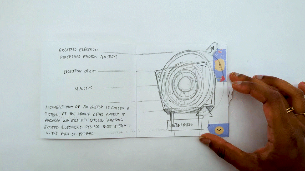
Dial prototype explaining photon release in an atom

Prototype accordion binding for both A Light Read and A Short Read
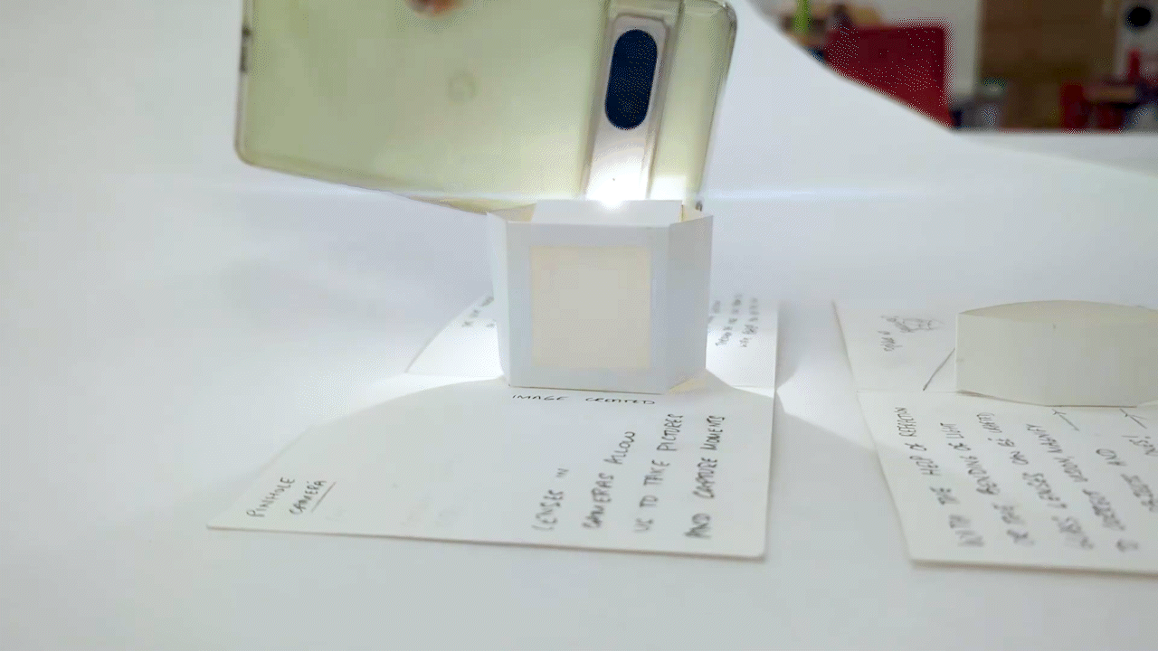
Pin hole camera prototype which spread didn’t make it in the final
Using layout styles inspired by museum exhibit design: Bold colors and explainer wall text
With the folds and text finalized, I focused on color and layout, aiming for the books to feel like a mini-museum of experiences. Inspired by museum gift shop aesthetics, I emphasized bold colors and short, simple text.

A composite of the pages and layout of A Light Read and A Short Read

Books are judged by their covers: Designing an abstract cover that hinted at the content within
I wanted the two book covers to work independently as well as when placed side by side. It was challenging to balance the abstraction while still maintaining the childlike approachability and intrigue.


Final cover design using the abstract prism refraction design

Final cover design using the abstract electromagnetic spectrum